What the prototype was built to test: will a user landing on the first screen immediately understand that Plated is not a delivery app and not a meal kit, and know what they are being asked to do without any explanation.
It is not fully functional; instead, it focuses on the features that make my "product sense" behind this complete. I understand that we are several hours of prompting away from actually shipping a finished product.
What changed
Health focus field: chips replaced with free text.
All three users in the feedback session slowed down or abandoned the health focus chip row. The categories were either too broad to be meaningful ("Balanced meals") or too clinical to feel personal ("Anti-inflammatory"). D. skimmed past it entirely. A. said she wanted to be specific about ingredients, not categories. The chips were replaced with a single free text area with a placeholder that models the level of specificity the curator actually needs: "e.g. high protein, no canola oil, low sugar, anti-inflammatory." The hint copy was updated to match: "Be as specific as you like. Your curator plans around what actually matters to you." This change makes the onboarding form do its actual job, which is giving the curator enough to work with rather than forcing users into a taxonomy that does not fit their situation.
Kitchen vetting note added to plan approval screen.
Two out of three users asked unprompted how the kitchens are selected and vetted. The question surfaced from different angles: D. asked it practically, A. asked it from a quality standpoint. Both asked it at the same moment: when they saw the meal plan for the first time. A single note was added above the plan card: "Every kitchen on Plated is vetted for quality, sourcing standards, and cleanliness before your meals come from there." It appears before the user sees the meal list, which means it sets the frame for how they read the restaurant names. The question gets answered before it becomes doubt.
What did not change
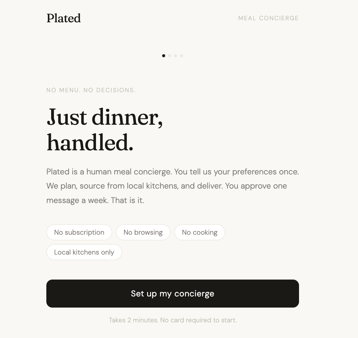
The landing screen headline and pill row. P. and A. read it carefully and understood the product immediately. The headline is working for the core user. D. skimmed it, but D. is the lightest fit for the target profile. No change warranted.
The single-confirmation approval flow. Nobody asked for more granular control at the approval stage. Requests for ingredient specificity were addressed upstream in the onboarding form. The one-tap approval stays intact.
The "Request a change" button. A. specifically cited it as the thing that made her feel safe enough to consider approving. It stays where it is, above the approval button, in the same position.
The curator attribution. "Curated by Maya" stays in the plan header. The question it raised, "Is Maya a real person?", is real and important. But it is a product question, not a prototype question. Answering it requires a decision about the human-versus-algorithm model that is above the prototype's pay grade. It is flagged for the next stage of product development, not patched with copy in this iteration.
Decision log
The feedback session produced two clear execution problems and confirmed the core concept. The health focus chips were forcing users into categories that did not match how they actually think about food, so they were replaced with a free text field that lets users say exactly what they mean. The kitchen vetting question surfaced independently from two different users at the same moment in the flow, which made it a pattern worth addressing directly; one line of copy before the meal plan card resolves it without adding complexity. Everything else, the landing screen, the approval flow, the curator attribution, the "Request a change" button, held up under scrutiny and was deliberately left unchanged. The most important unresolved question from this session is whether the curator is a real person or an algorithm. That question cannot be answered in the prototype. It needs to be answered in the product.