A follow-up to "Deconstructing Something You Use Everyday: A product breakdown of Google Maps"
TEXTReal World Product Innovation · Reflection — Intent vs Outcome
Project
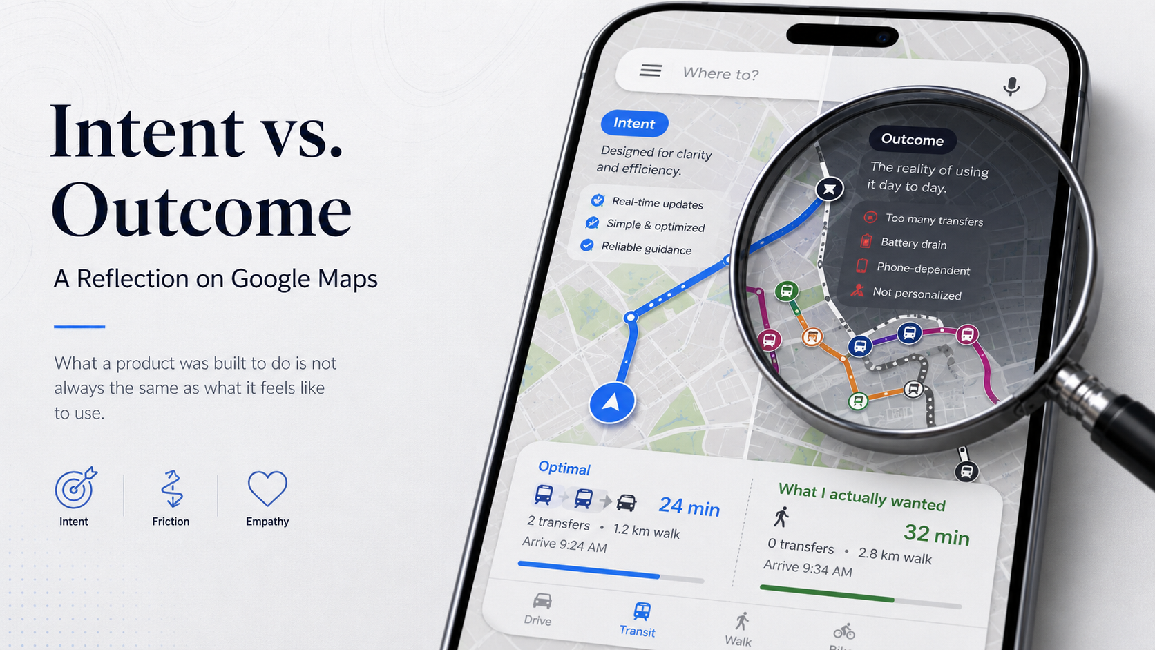
Intent vs. Outcome: A Reflection on Google Maps
This is a follow-up to the previous piece, Deconstructing Something You Use Everyday: A product breakdown of Google Maps. That project compelled me to see the decisions inside a product. This one asks something harder: to sit with the frustrations those decisions created, and understand why a creator might have made them anyway. Same product... but a different lens.
Prompt 1: What was the creator originally trying to do?
Google Maps was originally built to replace the static, one-size-fits-all experience of physical navigation, paper maps, road signs, printed directions, with something dynamic. The core goal was to put the user inside the map rather than in front of it: tracking their location in real time, computing the best route to their destination, and updating both as conditions changed.
Before Google Maps, navigation was a fixed snapshot of the world. You looked at a map, figured out where you were, plotted a path, and hoped nothing changed between then and when you arrived. Google Maps made it a live conversation between the user and their environment. That shift, from static to responsive, seems to be the original intent. Everything else grew from there.
Prompt 2: Where does this product feel frustrating or limiting to me specifically?
Two frustrations stand out, and they are different in an interesting way.
The first is about personalization. Google Maps decides what "efficient" means on my behalf, and 90% of the time it is right. But there is a 10% of cases where I want something different, where efficiency is not the point. A few weeks ago, I took a trip to the Hamptons with friends. The route Maps gave me was long and complicated: walk, train, train, bus, walk. What I actually wanted was simpler: walk a bit, take as few trains as possible, then Uber the last stretch. There was no way to tell it that. No way to say "I am willing to trade some optimization for fewer transfers." It just gave me its version of the best route and expected me to follow it.
The same thing happens closer to home. On a good summer evening, I sometimes want to walk longer before getting on a train — not because it is faster, but because the weather is nice and I want the time outside. Google Maps does not know that. It cannot know that, because I have no way to tell it.
The second frustration is more personal. Real-time navigation drains my battery fast, and I also just do not enjoy staring at my phone while I walk. So most of the time, I look at the route once, memorize it visually, and put my phone away. Maps was not designed for that. It assumes you will keep it open.
The difference between these two frustrations matters. The first is a deliberate product decision: Google almost certainly knows that some users want more control over how they commute. They chose not to build it, likely because deep personalization at global scale would add complexity that hurts the majority of users who just want a clean, fast answer. The second is a technical constraint that hits me harder than most because of a personal preference, phone-free walking, that falls well outside what Google optimized for. One is a tradeoff. The other is a personal mismatch.
Prompt 3: Does understanding the intent behind these limitations change how I feel about them?
Honestly, it does not make the frustrations disappear. My specific pain points still exist. On a summer evening when I want to walk longer before catching a train, Google Maps still cannot accommodate that. On the Hamptons trip, it still gave me the complicated route instead of the simpler one I actually wanted.
But it does make me more empathetic toward the people who built it.
Before doing this analysis, my instinct would have been to simply complain: "this feature is missing" or "this app does not do what I need." What I did not stop to appreciate was everything the product does do. Google Maps gives me single-place access to navigation, transit, local discovery, and business information, solving 80% or more of my daily needs without me having to think about it. The frustration only surfaces in the remaining 20%, and when I am honest with myself, that 20% is not as frequent as it feels in the moment.
There are products that do specific things better.Citymapper is more accurate for transit. Beli is more trustworthy for restaurant discovery. Claude or Perplexity can surface things to do near me by drawing on far more sources than Maps ever could. But none of them do everything in one place. Google made a deliberate bet on breadth, and that bet presumably serves users well most of the time.
What this reflection changed is the direction I point the frustration. It is less "Google Maps should fix this" and more "this is what I signed up for when I chose a product built for everyone." The 20% of cases where it falls short are not accidents. They are the cost of the 80% where it works seamlessly. Understanding that does not make the cost disappear... but it does make it feel less like a failure, and more like a tradeoff I can live with.
A note on the first two projects together
The breakdown asked me to observe without judging. This reflection asked me to judge, but carefully, with full context. Doing them in sequence revealed something I did not expect: the frustration I felt toward Google Maps was real, but it was also uninformed.
I was reacting to the 20% without accounting for the 80%. That is not how good product thinkers operate. They see the whole decision, including the parts that work, before they evaluate the parts that do not.
That is what I want to carry into the rest of this course.