3 iterations of the prototype to get us to a testable version
TEXTReal World Product Innovation · Project: Build and Iterate Your Prototype
Project
The riskiest assumption for Plated is that a user lands on the first screen and immediately understands what the product does and how it is different from every food app they already know. Each version of the prompt was a direct attempt to test that assumption more precisely.
Tool used
Claude, using HTML and CSS to produce self-contained interactive prototypes across three iterations. Each file represents a progressively more specific prompt, with each revision driven by a gap the previous version exposed.
v1 prompt
Build a meal delivery app called Plated for busy young professionals in NYC. It should collect the user's name, dietary preferences, and budget, then help them get started.
The output looked like a generic food delivery onboarding form. It could have been DoorDash. It could have been Factor Meals. There was nothing in the design or the copy that communicated what made Plated different. The prompt had not told the AI what the product actually does differently, so the AI defaulted to the existing mental model of a food app: a form, a button, get started. The riskiest assumption was already failing and I had not even shown it to a user yet. The AI did not know that there was no menu. It did not know the decision was already made. I had not said so.
v2 prompt
Build a meal concierge onboarding page called Plated for health-conscious young professionals in NYC in their mid-twenties. The key differentiator must be clear on the first screen: this is not a delivery app and not a meal kit. A human curator plans the user's meals based on a one-time preferences form. The user approves one plan per week. There is no menu to browse. The onboarding form should collect dietary needs, health goals, budget per meal, and usual dinner time. After submitting, show a confirmation screen that explains what happens next: the curator will send a plan within 24 hours, and the user approves it with one message. No subscription. No commitment. Exclude any browsing interface, any menu, and any subscription language.
The differentiation language landed on the first screen. "Not a delivery app. Not a meal kit." made the product feel genuinely different from what the user already knows. But v2 exposed a new gap: the confirmation screen told the user what would happen next, but I had never actually shown them what approving a plan looks like. The moment that matters most, the one-tap approval, was described in copy but not demonstrated. If a user does not understand what they are agreeing to, they will not trust the curator enough to say yes. V2 forced me to build the plan approval screen rather than just describe it.
v3 prompt
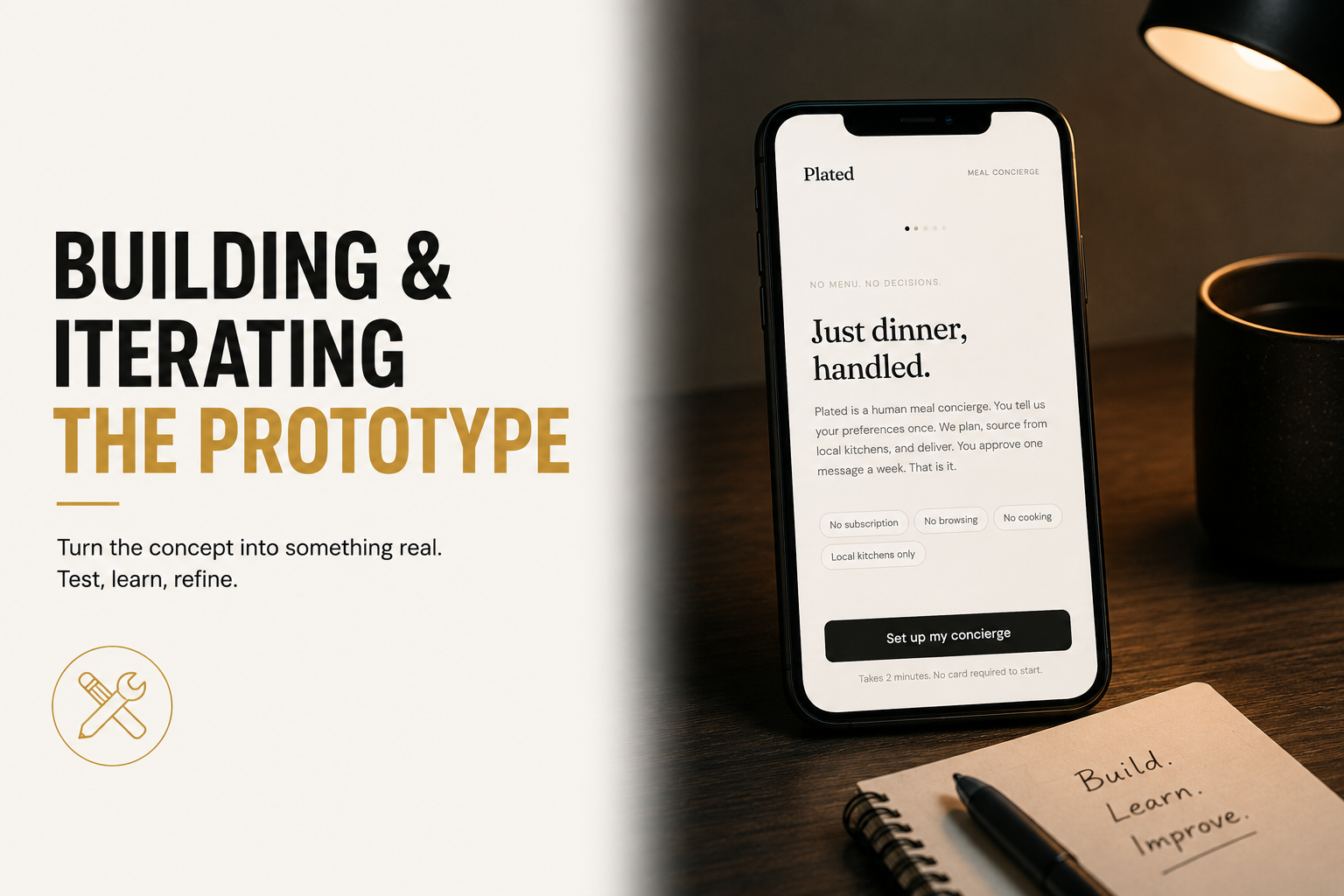
Build a full four-screen interactive prototype called Plated. Screen 1: landing page with headline "Just dinner, handled." and subhead explaining this is a human meal concierge, not a delivery app and not a meal kit. Show four pills: No subscription, No browsing, No cooking, Local kitchens only. One CTA button labeled "Set up my concierge." Screen 2: onboarding form labeled "Tell us once." Fields for name, dietary needs as a free text area, health focus as selectable chips (High protein, Balanced meals, Low sugar, Anti-inflammatory, Low carb, No preference), budget per meal as chips (Under $12, $12-18, $18-25, $25+), usual dinner time as chips (6-7pm, 7-8pm, 8-9pm, After 9pm), and delivery address. Submit button labeled "That is everything, set it up." Screen 3: plan approval screen labeled "Your first plan is ready." Show a weekly meal plan card with five meals sourced from real NYC health-forward restaurants, each with day, meal name, restaurant, and price. Weekly total shown at the bottom. Two buttons: "Looks good, approve this plan" and "Request a change." If Request a change is tapped, show a text field where the user can message the curator. Screen 4: confirmation screen with headline "This week is sorted." and copy explaining meals will arrive each evening, next week the curator will send a new plan on Sunday, and there is no subscription or commitment. Include progress dots between screens. No accounts. No login. No subscription flow.
The plan approval screen was the most important thing v3 forced me to build. Seeing five real meals from real NYC restaurants with a curator's name attached changed the feel of the product entirely. It stopped feeling like an algorithm and started feeling like a person. The curator attribution, "Curated by Maya," was a detail that emerged from building the screen rather than from the prompt. Without it, the plan card looked like a generated list. With it, the trust assumption became plausible in a way it had not been before. V3 also revealed that the "Request a change" flow needed to exist before the approval button, not after. If a user sees the plan and wants to change something, they need to know that option exists before they commit.