A compilation of the evolution of the product sense that culminated in Plated. My final project for this excellent, thought-provoking course :)
TEXTReal World Product Innovation · Project: Assemble Your Final Artifact
Project
Final Artifact: The Moving Pieces
Problem Statement
Health-conscious young professionals in NYC end every long workday facing the same impossible tradeoff: eat affordably and sacrifice quality, eat well and strain the budget, or cook when there is nothing left in the tank. No existing option clears all three bars at once; and the mental cost of searching for one is high enough that most people default to the path of least resistance rather than look. The cost compounds daily. This problem does not include people willing to cook or those for whom food quality is negotiable.
Product Concept
What it is
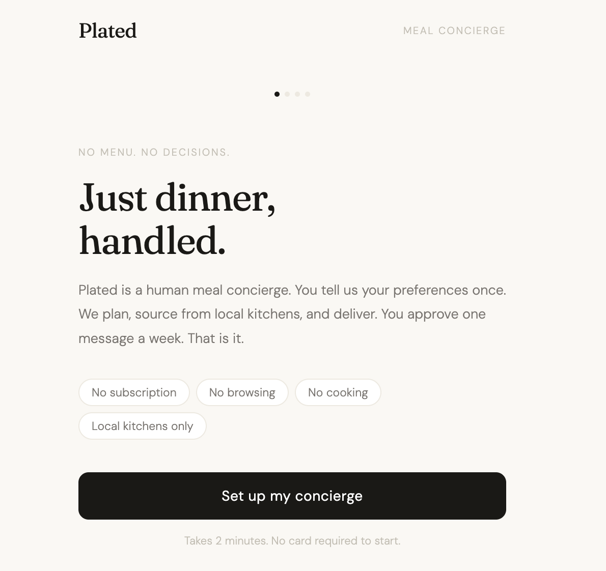
Plated is a human meal concierge for health-conscious young professionals in NYC. You fill out a one-time preferences form. A curator plans your week, sources from vetted local kitchens, and sends you one plan to approve. One tap confirms it. Everything else is handled.
Who it is for
Health-conscious young professionals in NYC in their twenties, finishing a long workday mentally and physically exhausted, who care about what they eat but have neither the time nor the energy to search for a good option by the time evening arrives.
Core job
Removes the daily food decision entirely, so the user ends the day well-fed without spending a single minute thinking about what to eat.
The insight
Fifteen conversations revealed that the barrier is not the absence of good options. It is the cost of finding them. Even users who care deeply about health default to cheap, low-quality food not because they have given up, but because searching for a better option is itself a tax on a depleted mind. The only solution that works removes the search entirely. Improving what gets searched for is not enough.
What it does
Learns the user's dietary needs, health focus, budget, and schedule through a one-time onboarding form, updatable at any time
Sends one ready-to-approve weekly meal plan, curated by a human to those preferences, activated with a single confirmation
Coordinates sourcing and delivery from vetted local kitchens entirely on the user's behalf
What it does not do
No subscription or recurring commitment; the user engages on their own terms
No browsable menu or option selection; giving the user options to scroll through is a search interface in disguise, which defeats the core job
No centrally produced or nationally shipped meals; local sourcing is what makes the freshness and health promise credible in a way that national meal kit services cannot match
Key tradeoff
Plated gives up user control and geographic scale. Users who want to browse and handpick will be frustrated. Users outside NYC cannot use it yet. Both are deliberate. The core user does not want control over the daily decision. They want it gone. And local depth is what makes the quality promise real. Plated bets on doing one thing exceptionally well for one specific person in one specific city, rather than doing many things adequately for everyone everywhere.
What this prototype was built to test: a user lands on the first screen and immediately understands that Plated is not a delivery app and not a meal kit, and knows what they are being asked to do, without any explanation, within the first five seconds.
Decision Log
What feedback was received
Three users matching the target profile interacted with the v3 prototype without any explanation. P. (26, product manager), D. (24, consulting analyst), and A. (27, freelance designer). Two sessions surfaced the same two issues independently.
First: all three slowed down or abandoned the health focus chip row on the onboarding form. The categories felt either too broad or too clinical. D. skimmed past it. A. said she wanted to specify ingredients, not select from a predetermined list.
Second: D. and A. both asked, unprompted and at the same moment in the flow, how the kitchens on the plan are selected and vetted. D. asked it practically. A. asked it from a quality standpoint. Neither had seen the other's session.
P. asked whether the curator, attributed as "Maya," was a real person. This surfaced as the most important unresolved question from the session.
What changed
The health focus chips were replaced with a free text field. Placeholder copy models the specificity the curator actually needs: "e.g. high protein, no canola oil, low sugar, anti-inflammatory." Users can now say exactly what they mean rather than selecting a category that approximates it. A kitchen vetting note was added above the meal plan card on the approval screen: "Every kitchen on Plated is vetted for quality, sourcing standards, and cleanliness before your meals come from there." It answers the question before it becomes doubt, at the exact moment users are deciding whether to approve.
What did not change
The landing screen headline and pill row: P. and A. understood the product immediately from the first screen. The headline is working for the core user. D. skimmed it, but D. is the lightest fit for the target profile. No change warranted.
The single-confirmation approval flow: nobody asked for more granular control at the approval stage. The one-tap approval stays intact.
The "Request a change" button: A. cited it specifically as the thing that made her feel safe enough to consider approving. It stays above the approval button.
The curator attribution: "Curated by Maya" stays. The "Is Maya a real person?" question is real and important, but it is a product question, not a prototype question. It is flagged for the next stage of development. At scale, whether we can afford for real people being the curators is a business question that informs product strategy.
Final Artifact: Product Write-Up
The Problem
I started this project knowing the frustration personally. By the end of a long workday I had nothing planned for dinner, no energy to figure it out, and every available option forcing me to choose between affordable and healthy. My instinct was that the problem was a supply problem: not enough good options that were also convenient and reasonably priced.
Fifteen conversations corrected that. The people I spoke to were not failing to find good options. They knew what good options looked like. They were just not looking. The mental cost of searching for a better meal, by the time evening arrived, was higher than the cost of defaulting to something mediocre. The barrier was not the options. It was the search itself.
Revised problem statement: Health-conscious young professionals in NYC end every long workday facing the same impossible tradeoff: eat affordably and sacrifice quality, eat well and strain the budget, or cook when there is nothing left in the tank. No existing option clears all three bars at once; and the mental cost of searching for one is high enough that most people default to the path of least resistance rather than look.
The Concept
The reframe changed what needed to be built. A better search tool would not solve a problem caused by search fatigue. The product had to eliminate the search entirely.
Plated is a human meal concierge. You fill out a preferences form once: dietary needs, health focus, budget, usual dinner time. A curator plans your week, sources from vetted local kitchens, and sends you one plan to approve. One tap confirms it. Nothing else is required.
The core insight: the user does not want a better menu. They want no menu. Every existing solution, including Factor Meals and delivery apps, still asks the user to choose something. Plated removes that ask entirely.
What was deliberately left out: no subscription, no browsable menu, no nationally produced meals. Each exclusion protects the same thing: a product that requires nothing from the user beyond a single weekly confirmation.
What I Built and Tested
I built the Plated prototype across four iterations.
The riskiest assumption going into the build: a user lands on the first screen and immediately understands that this is not a delivery app and not a meal kit, without any explanation, within the first five seconds.
What building revealed: the meal plan card with real NYC restaurant names and neighborhoods did more trust work than any copy on the landing page.
Every user in the feedback session visibly shifted when they reached that screen. That moment, not the headline, not the onboarding form, is where Plated becomes real to a user. Local sourcing is not just a differentiator. It is the trust signal.
How I Used Feedback
I shared the prototype with three users matching the target profile. Two things surfaced independently across sessions.
First, all three slowed down at the health focus chip row on the onboarding form. The categories were either too broad or too clinical. I replaced the chips with a free text field. Users can now say exactly what they mean rather than selecting an approximation.
Second, two out of three users asked unprompted how the kitchens were selected and vetted. I added one line above the meal plan card: "Every kitchen on Plated is vetted for quality, sourcing standards, and cleanliness before your meals come from there." It answers the question before it becomes doubt.
What I did not change: the single-confirmation approval flow, the landing screen headline, and the "Request a change" button. All three held up under scrutiny and were left deliberately intact.
What I Learned
The most useful thing I learned was not about the product. It was about when to stop defining and start building.
I spent more time than I should have trying to make the problem statement impressive. The problem worth staying with was the unglamorous, daily one I had been living with for months without examining. Staying with it, and sharpening it rather than solving it prematurely, produced a concept I actually believe in.
The question I carry out of this course: is the curator a real person when the product is at scale? One user saw "Curated by Maya" and immediately asked whether Maya was real. That question, surfaced in a prototype session, is the most important unresolved thing Plated carries forward. The product's entire trust proposition rests on a human relationship. How that scales is the decision that will define the product more than any feature I could add.